
A visual design project at university to design and implement a brand identity for a fake client. The client I chose was a charity organisation who documents Ancient Egyptian history and myths, under the name The Chronicles of Ancient Egypt.
The client doesn't currently have a logo or visual identity, and their website is purely textual, with no design. They need their new brand and visual identity to convey "mysterious", "wonderous" and "ancient". The website would need to be informative but fun and exciting that is great for learning, and looks visually pleasing.
The main audience would be kids ages 8-16 but also Egyptologists, Historians, and Mythologists whom are teaching the subject, and also anyone with a keen interest in Ancient Egypt.
After experimenting with the iconic Tutankhamun mask, I decided to go with Anubis iconography for the logo. I liked how Hieroglyphics are formed using simplistic lines and shapes, so I used this as inspiration, and paved the way to create my Anubis icon design: with simplistic shapes utilising the negative space to create the Hieroglyph-like icon. Using this icon, I experimented with different variations and ways to create the logo. Until, I landed on a design that would work perfectly with the brand name.
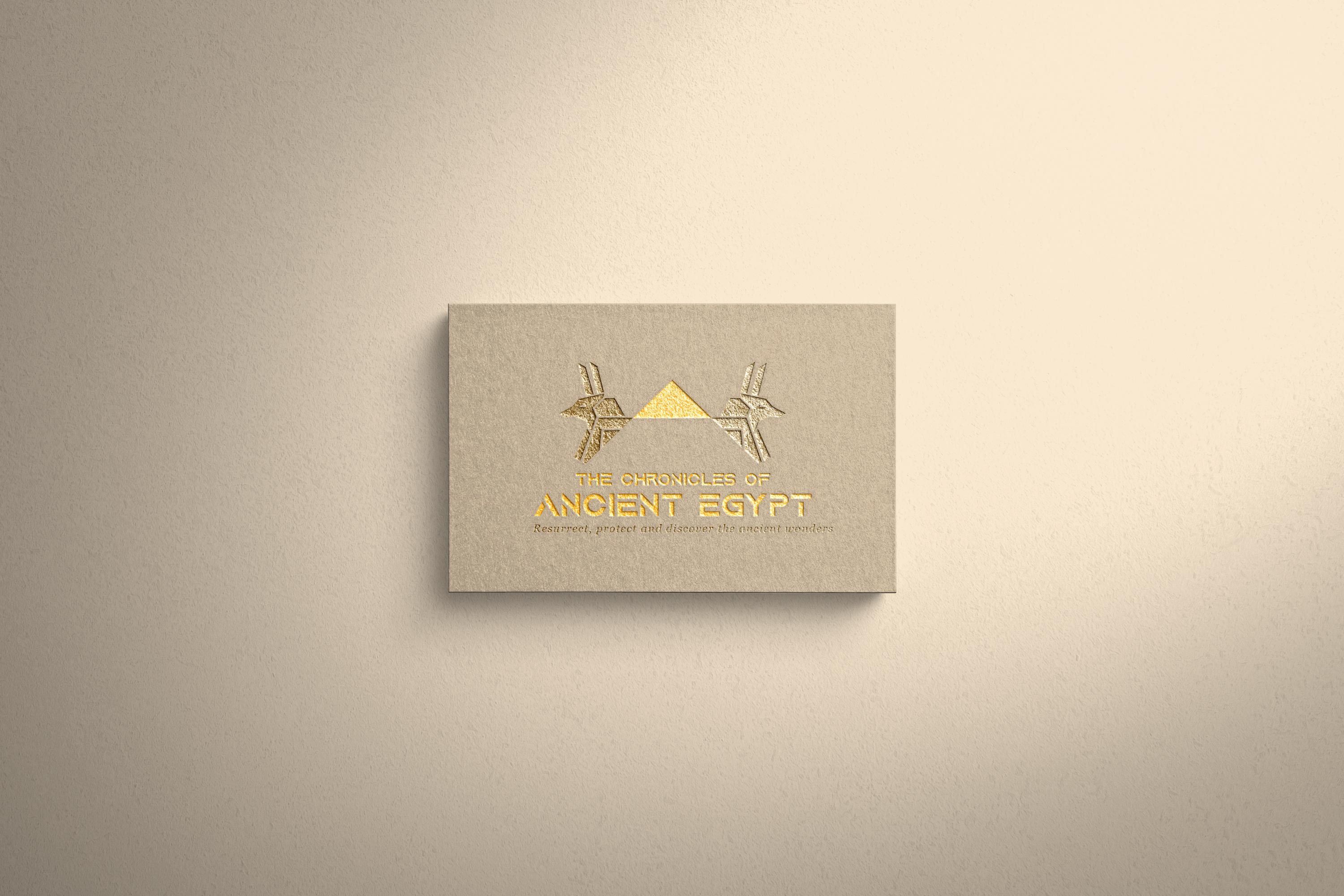
The design incorporates 2 Anubis icons back to back to make the shape of a pyramid in negative space. I added a pyramidion (pyramid capstone) inbetween the Anubis’s to more plainly visualise the pyramid, and the brand name is used as the base of the pyramid in a font that has similar aesthetics.
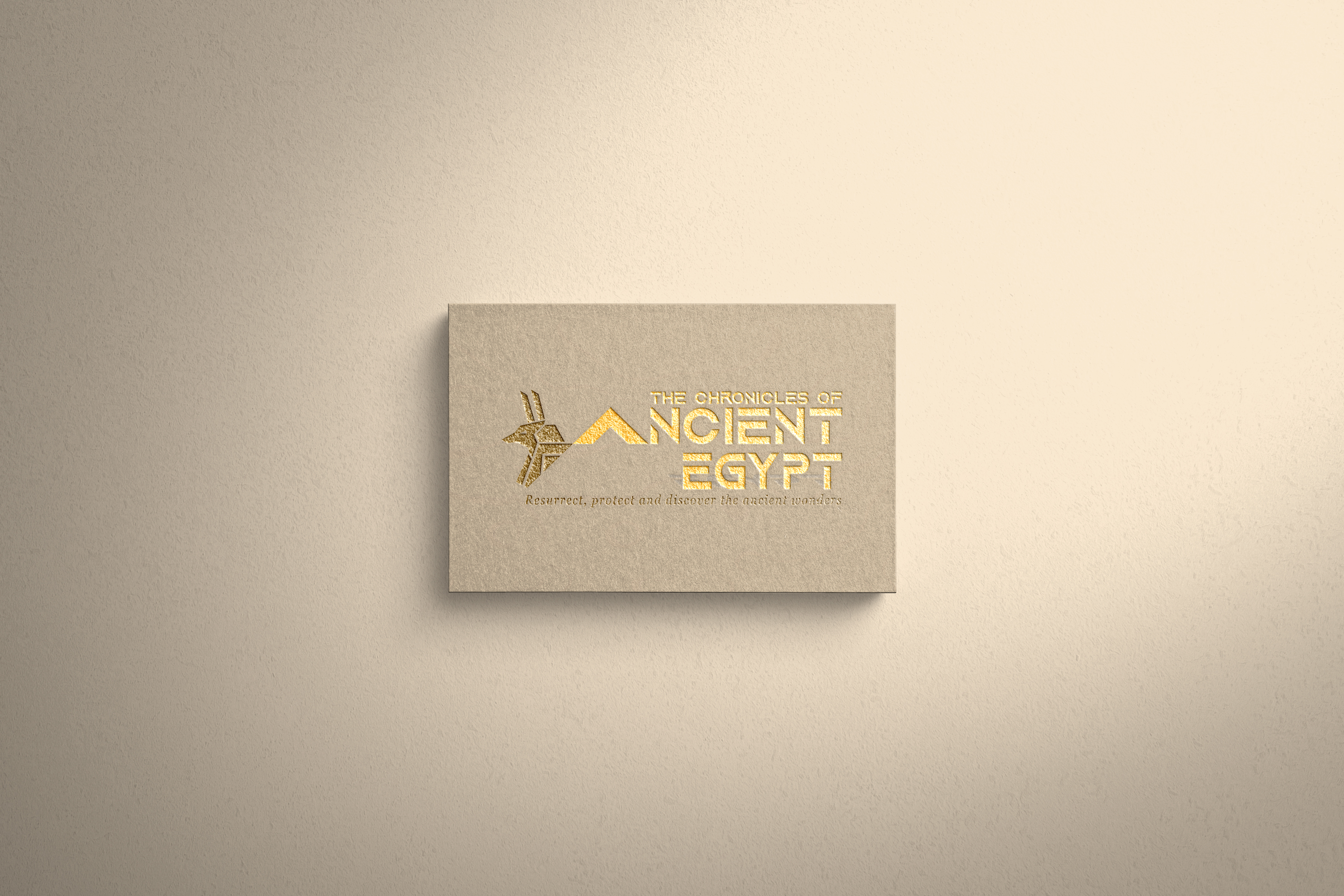
I also designed a secondary logo that is more of a focus on the brand name, with larger font, so it can be used and seen properly on the website. This design still incorporates the negative space pyramid with Anubis, however, the pyramidion now acts as the “A” of “Ancient” in the brand name. And the tagline is used as the pyramid base.
There a 3 colour schemes: a dual-colour gold and brown, a monochrome black, and a monochrome beige. This is in case the primary dual-colour doesn’t suit the usage of the logo. For the primary colour scheme it was important to differentiate the brand name and the pyramidion from the rest of the design.
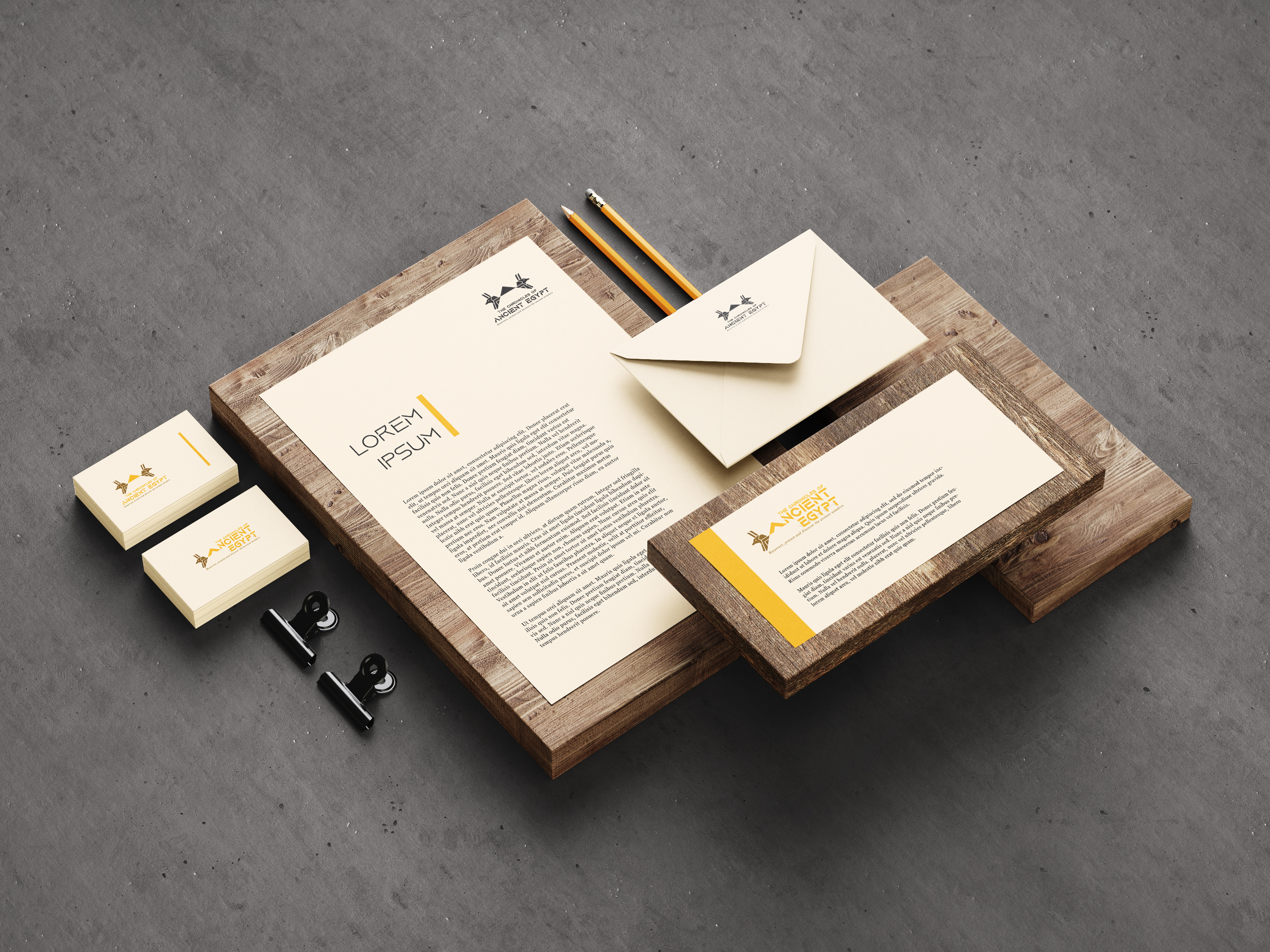
After the logos had been complete, I created mockups using the logos. These included business cards and stationary. I absolutely love the business cards, they look really good, especially because it’s embossed and glittery, which really makes the logos pop. I love them so much I do wish I could have a physical copy.
Overall, the logo designs have turned out really good, they reflect the client’s keywords well, and I love how the usage of the principle of closure and negative space have come together to create such great and interesting designs.
I created 2 differing style tiles to get a feel for the design elements and UI choices. The first style tile was of a more flat style incorporating flat vector graphics, and UI elements with a cream background. This, however, looked dull and the UI was lost amongst all the colour. The second style tile was much better as it included a mix of flat design and skeuomorphism design to create a unique blend of UI elements and graphics. Certain elements would feature flat vector graphics, and others would feature real-life photographs. The white background now makes all other visuals standout.
After the style tiles were complete, I drew up some wireframe designs for both mobile and desktop, using the 2nd style tile as a guide for the UI.
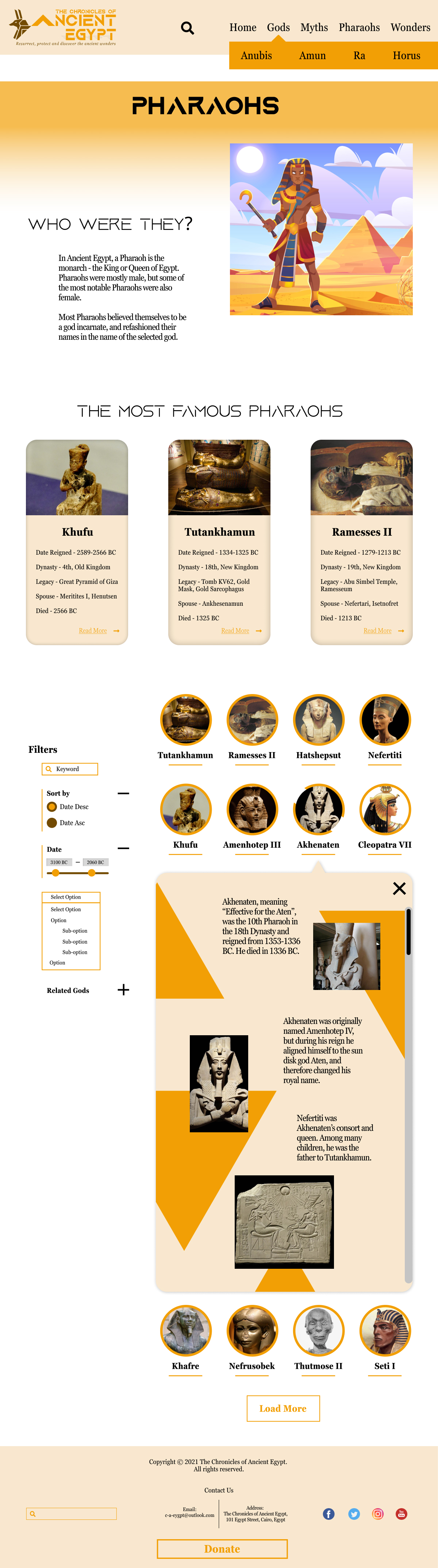
I designed 3 wireframes for the Home page and the Pharaohs page, each much better than the last. The 3rd design of the Home page used geometric triangular shapes in the background for added visual stimulus to lead the eyes toward the next section of the page and make it standout from the rest. The 3rd design of the Pharaohs page is similar to the 2nd design, except that it shows the design for the on-click pop-up details about the Pharaoh. This took inspiration from the pre-2019 Google Photos, where the details box appears underneath the clicked element’s row, a bit like an accordion. I designed the pop-up details box to also have the triangular shapes in the background. I chose to implement the 3rd design for both pages because they are significantly better than the previous designs.
The final designs are enriched with colour and content, and complete with a banner/hero image that entices the audience to explore. I love how the final designs have come together. The look and feel of it is fun and visually pleasing, while educational. While front and foremost it’s an educational website for kids and Ancient Egypt enthusiasts, by having the “Current Egyptian Excavations” section, it is also hinting that it is still documenting the current finds of Egyptian antiquities.
I love how the “Myth or Fact” section intrigues the viewer to find out more by using both real photographs and graphic artwork for different articles. The triangular background contrasts nicely and sets it apart from the page, enticing the viewer even more because it’s a different feel.
The Pharaohs page has a nice opening with a contrasting illustration explaining who the Pharaohs were. I like that the illustration overlays the gradient background and the text is offset giving it a nice contrasting elevation to the layout. I love the circular section links, they have worked out really well, especially with the accent gold border. The on-hover/focus state has the border broken in 2 places which gives a cool effect, and I envision that these would have a lovely animated effect. I’m not overly keen on the filters UI, I think they could do with some more work and making them more seamless into the design. I like the idea of the Google Images-style details box, however I think the colours may be a little in your face, and maybe need dialling back a bit.
Overall, I am really pleased with the final designs and the general UI. Using various Gestalt principles, like proximity and alignment, I’ve designed visually pleasing, vibrant, and unique pages that I would like to one day develop into a working website.